Logo Recreation and Branding Guide
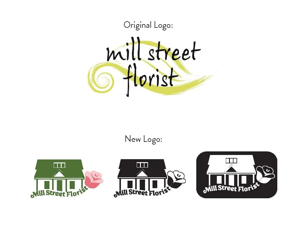
This branding project focused on refreshing the visual identity of Mill Street Florist, a long-standing local business. The primary goal was to design an updated logo supported by a cohesive system of fonts, colours, and patterns.
Mill Street Florist Brand Refresh
Tools
Procreate was used for brainstorming and initial sketching at the beginning of the project. Adobe Illustrator was then used to create all design work, which was compiled into a complete brand booklet in Adobe InDesign. Adobe Photoshop was used to develop prototypes.


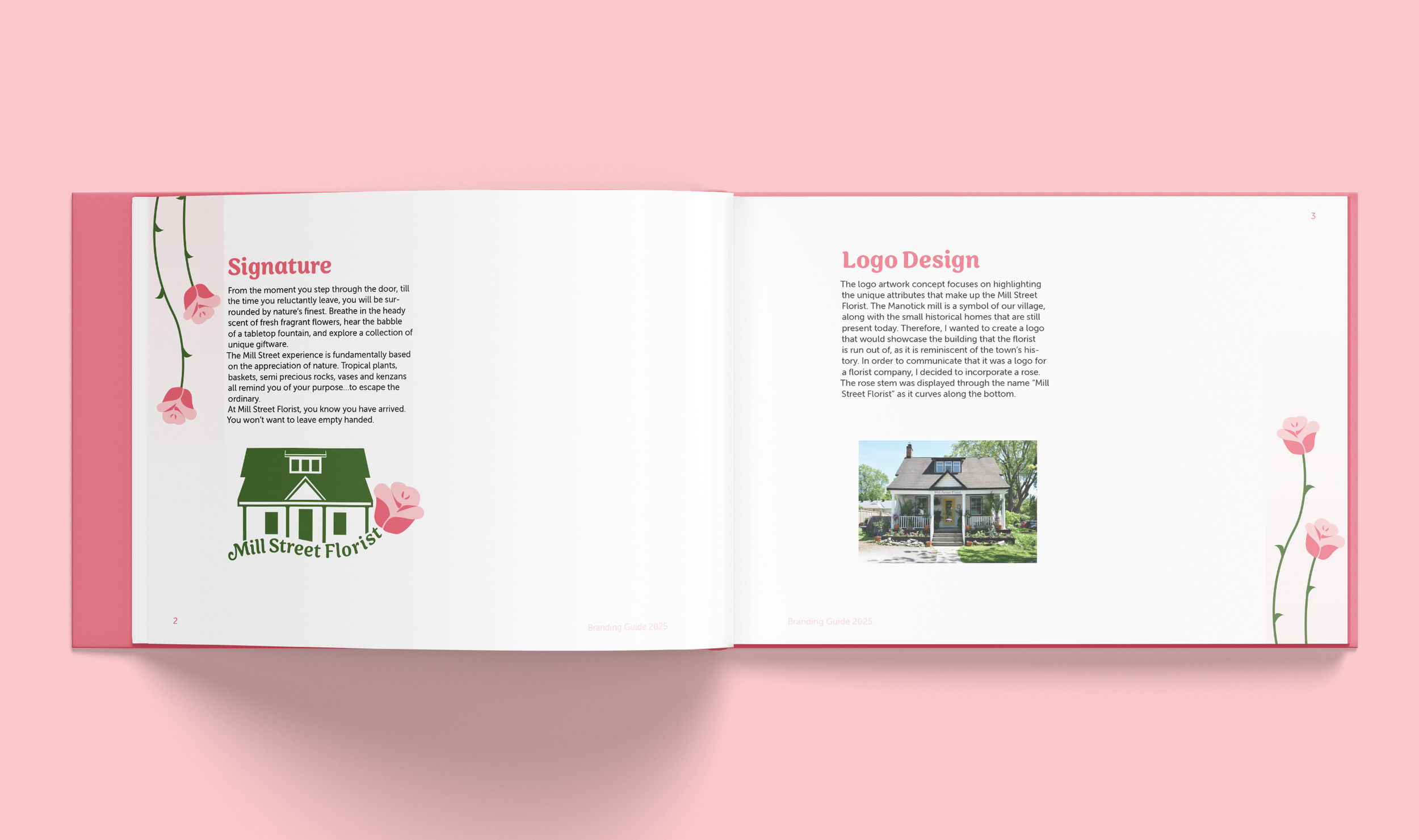
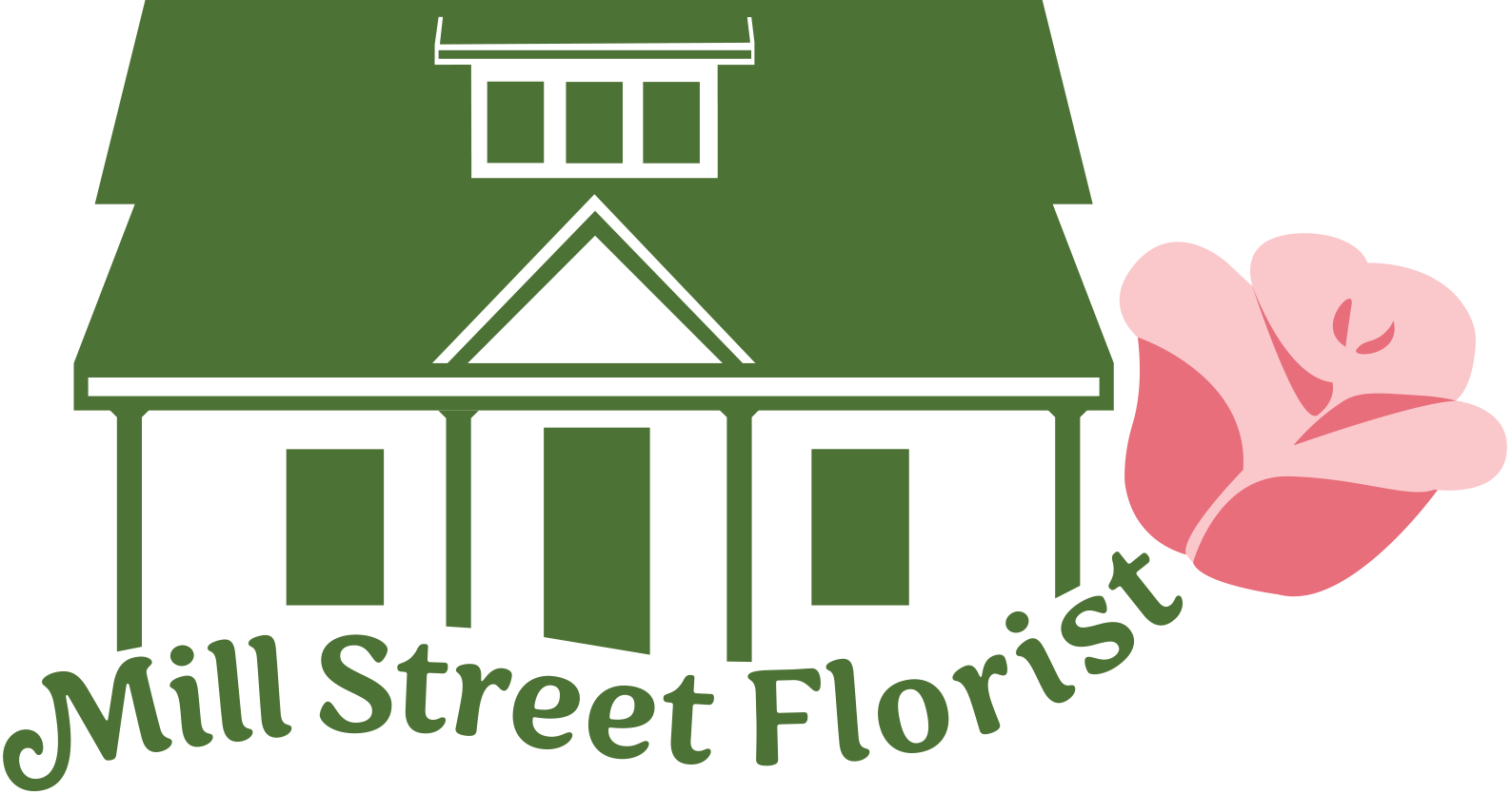
The process began with researching florist branding trends and sketching initial concepts. Wanting something more distinctive, I drew inspiration from the shop itself—a house-like building that has been part of the community for over 50 years. Incorporating this structure into the logo helped capture the florist’s history and charm.
The Process

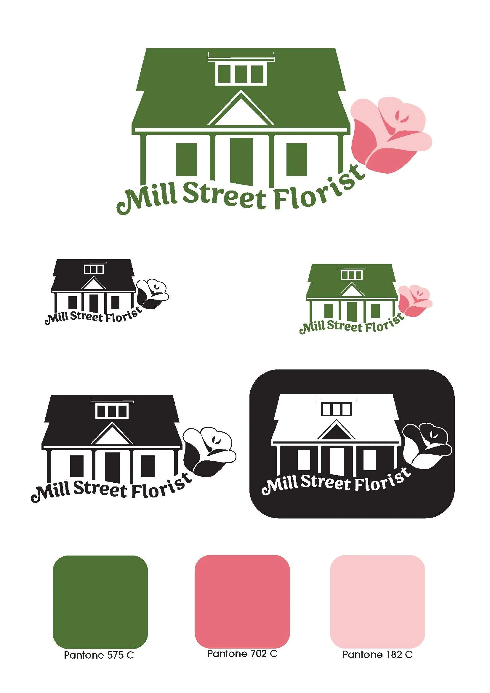
I developed multiple logo variations blending the house with floral elements, refining them through feedback from peers and my professor. The final design paired a crisp, architectural shape with softer typography inspired by the organic lines of a flower stem.
Development

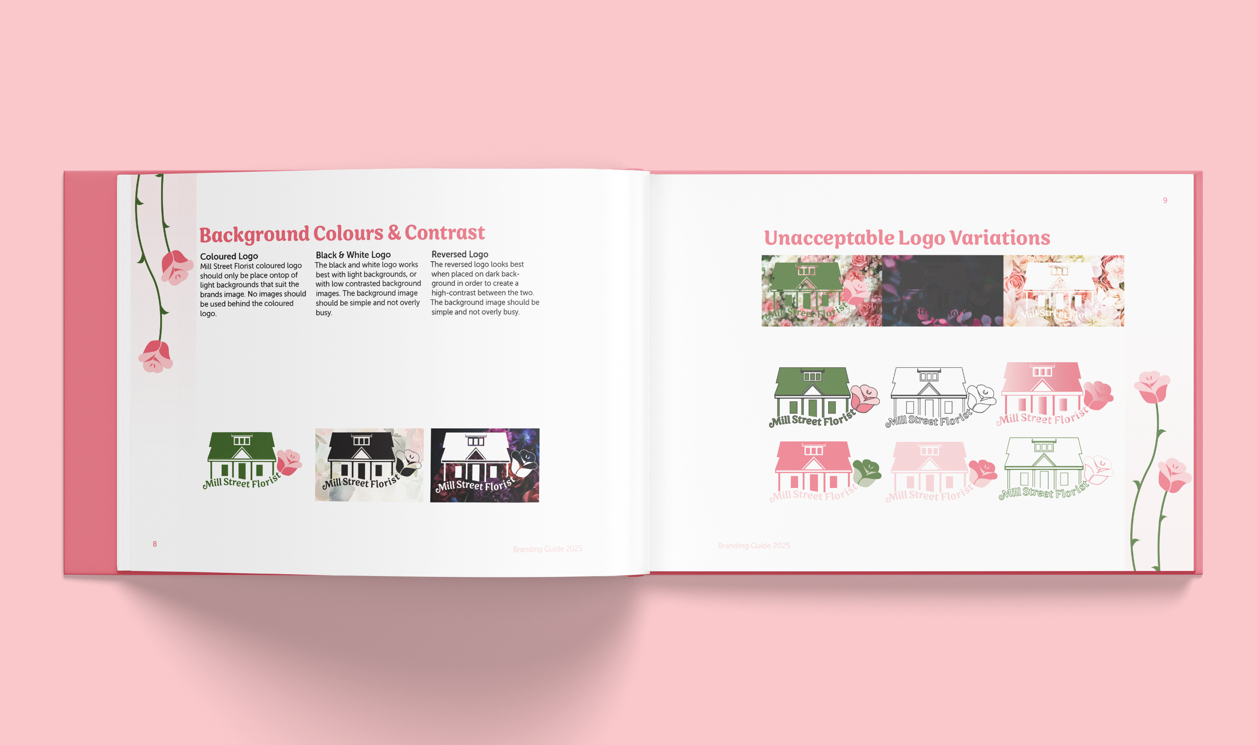
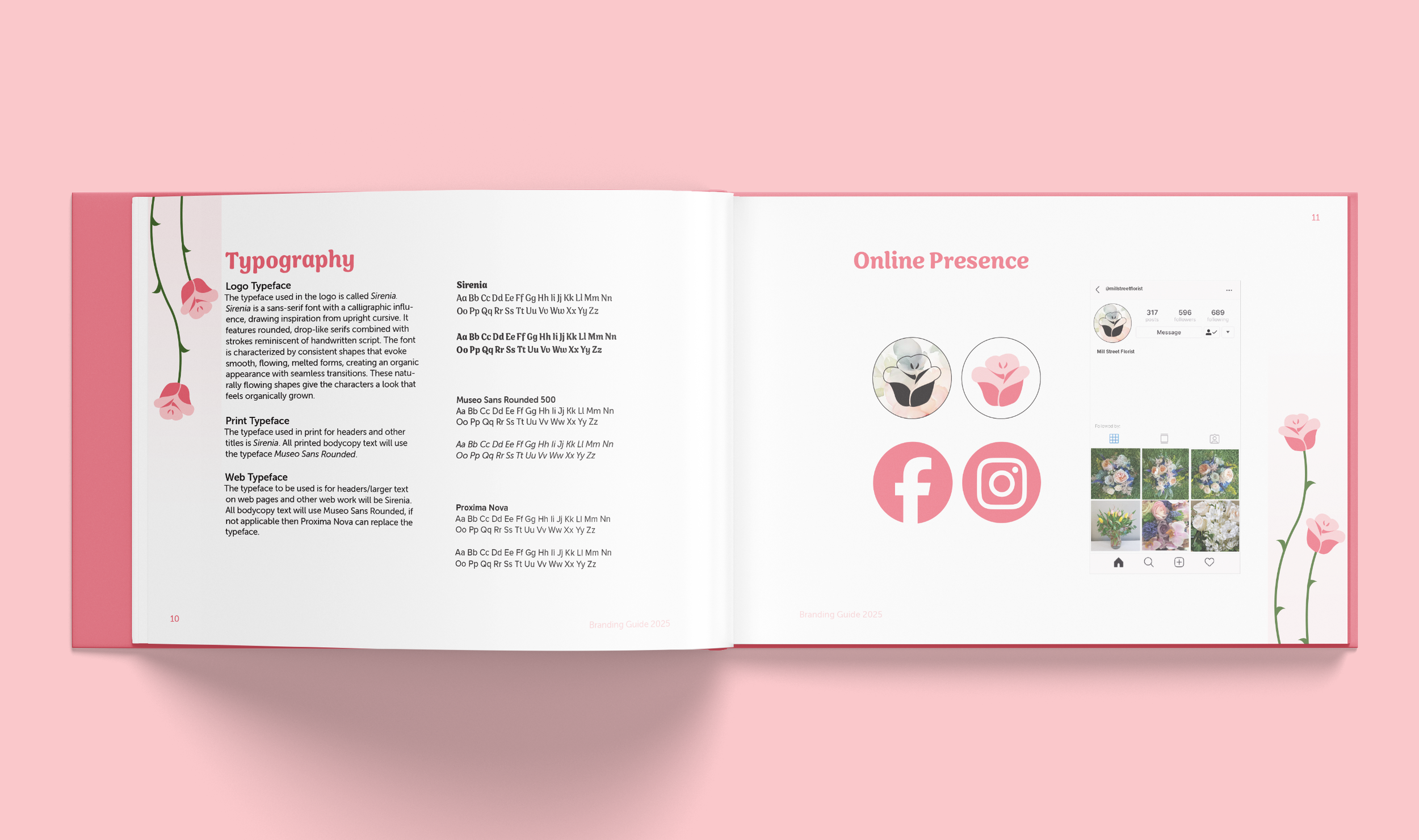
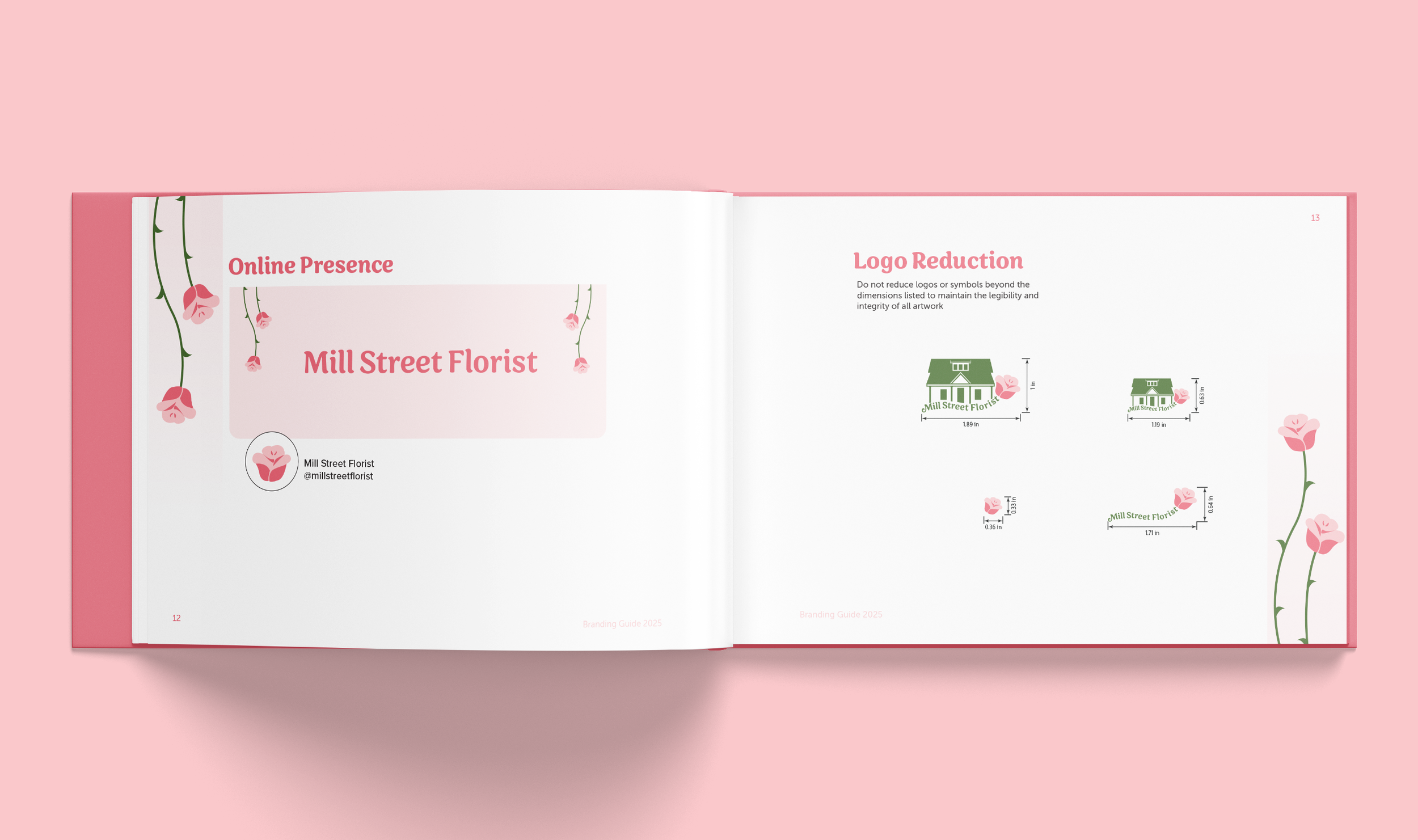
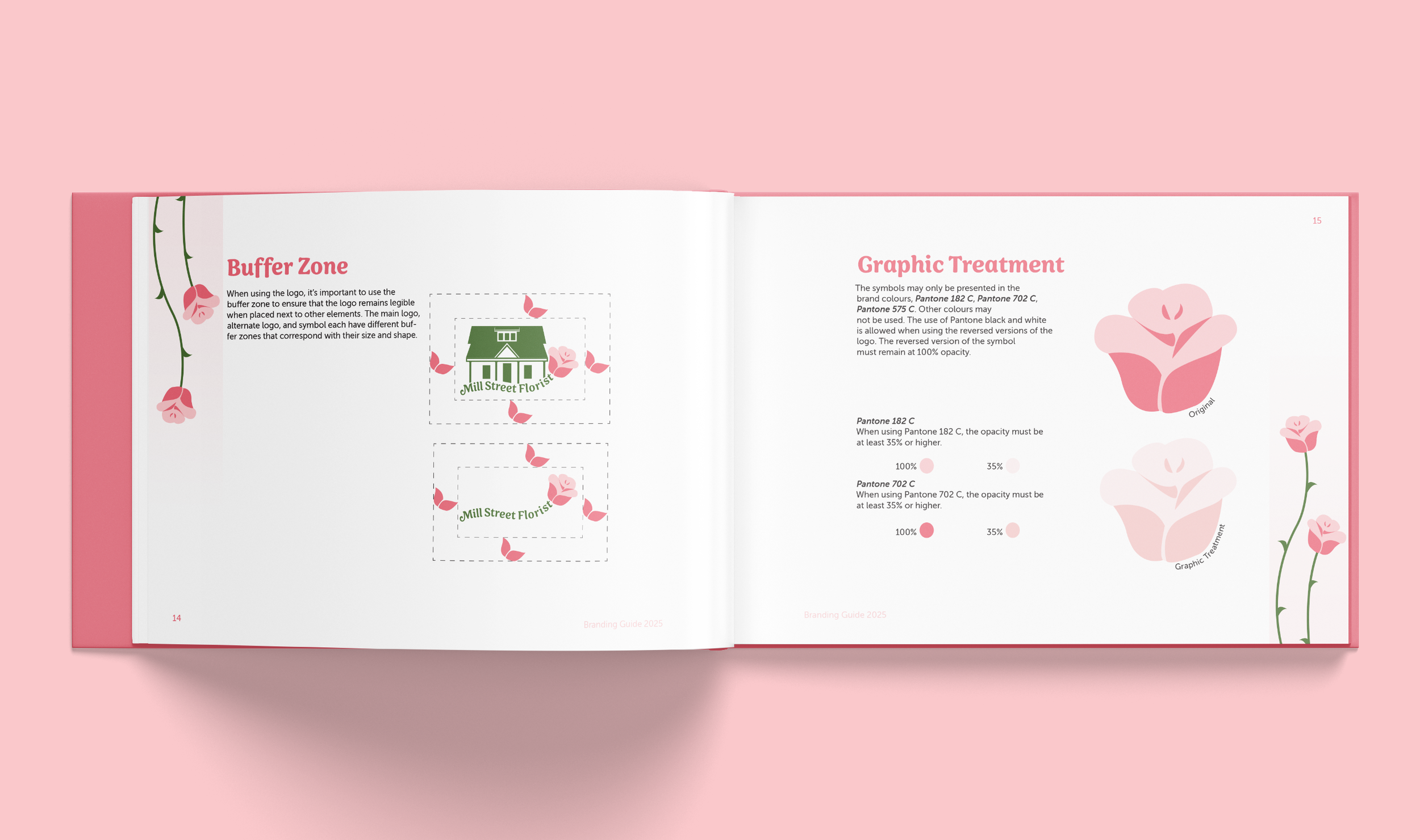
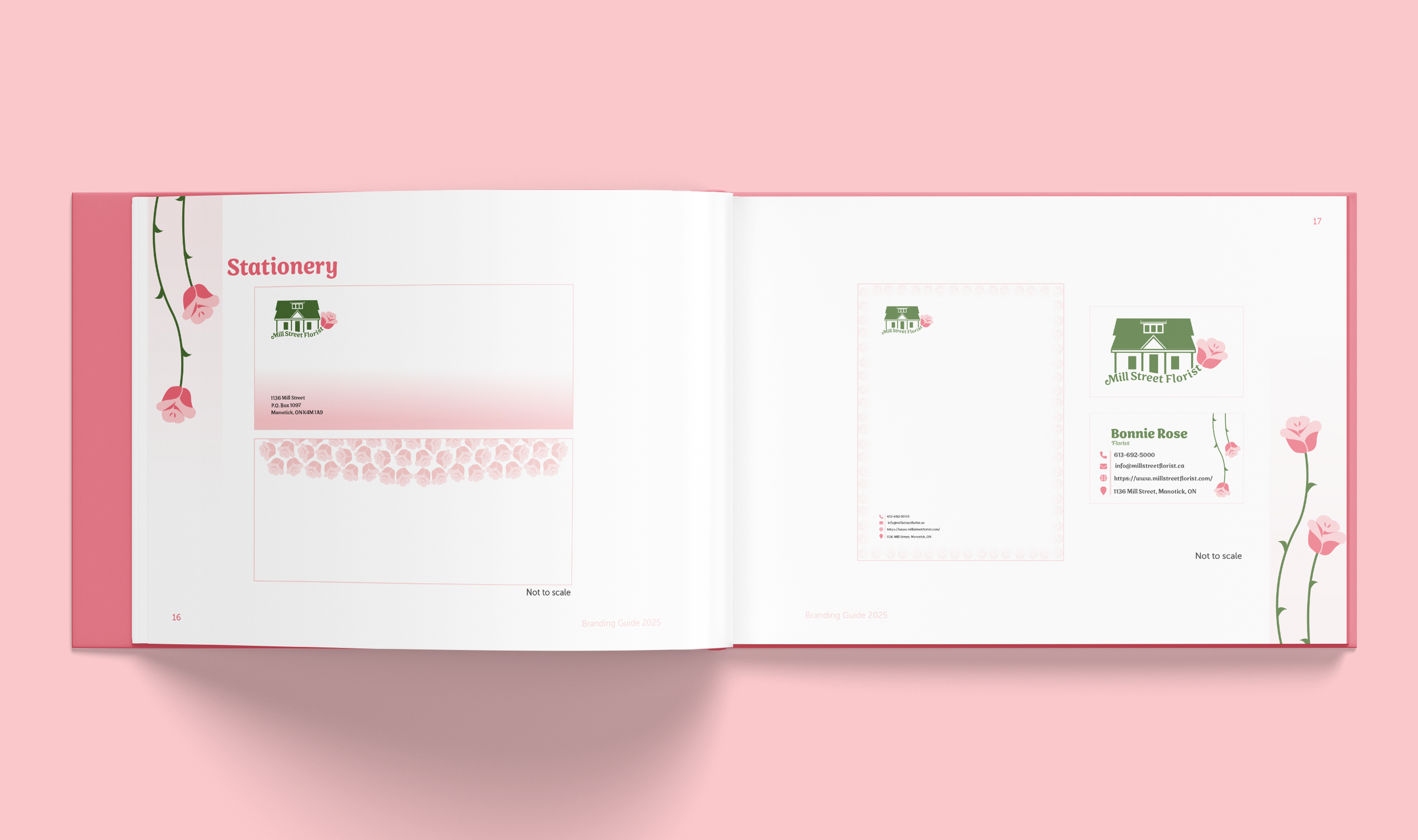
For the colour palette, I explored Pantone options and selected a deep mossy green with a vibrant pink to balance tradition and liveliness. From there, I built a full brand package including logo guidelines, type pairings, colour usage, and both digital and print applications.
The final deliverables featured website and social media mockups, stationery, and product applications—resulting in a modernized but character-rich identity that honours Mill Street Florist’s local roots.
Colour Palette
Brand Redesign
〰️
Floral
〰️
Brand Redesign 〰️ Floral 〰️


